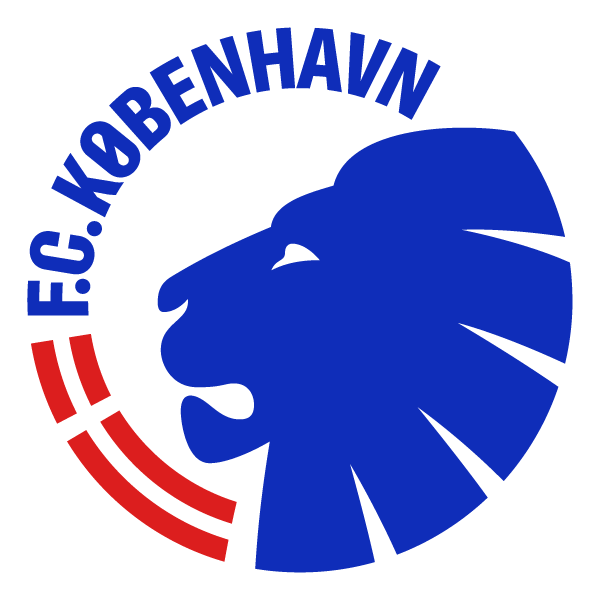
F.C. Copenhagen launch new look
F.C. Copenhagen today presents an update of the club's visual identity, which connects the club and the city even more closely and ensures an up-to-date brand that matches the club's ambitions.
Based on the 'We are Copenhagen' strategy and the club manifesto that F.C. Copenhagen presented in the autumn of 2022, the new look starts a fresh chapter for the club.
"We are in the process of implementing the 'We are Copenhagen' strategy in all corners of the club, and therefore we are naturally also updating the club's brand," says director of F.C. Copenhagen, Jacob Lauesen.
"At the same time, we are experiencing a significant international demand for FCK merchandise as a result of our European campaigns and a forward-looking academy. We naturally want to match that with a strong Copenhagen imprint."
Lions & Lionesses
The first match for F.C. Copenhagen's Women's team is approaching and the club's commitment to the team is incorporated into the updated brand. The club's new coat of arms has a male and a female lion.
"The club's branding had become too narrow in relation to where the club is today, and over time we also want to link the club's brand even closer to Copenhagen. Therefore, the goal was to create a visual style that conveys the essence of Copenhagen, signals our ambitions and paves the way for the development of F.C. Copenhagen as a strong sports and lifestyle brand both domestically and internationally," says Mads Jefsen, marketing director at F.C. Copenhagen.
>> See the new visual universe here
Closer connection to the city
Boosting the visual identity of the club has been needed to be able to match FCK's ambitions and strategic visions, particularly around the development as a football club and lifestyle brand.
The project has been underway for over a year, where F.C. Copenhagen has collaborated with the renowned Copenhagen agency Kontrapunkt, which was recently named the most winning design agency of the year.
"With our roots in Copenhagen, we are proud to be part of lifting the club and the brand to a new level. We have tried to bring the club and the city closer together with this updated identity, so F.C. Copenhagen, to an even greater degree, represents the capital both at home and in Europe. We have respected the central elements of the existing identity, and in addition created a more up-to-date and diverse expression that embraces all the club's teams and the desire to be more for Copenhagen," says CEO & Partner at Kontrapunkt, Johan Lawaetz.
Coat of arms & font of the city
In addition to a slight modernisation of F.C. Copenhagen's club crest, the iconic FCK symbol, the lion, has a more distinctive and modern expression.
New fonts with inspiration from Copenhagen street signs and a completely new aesthetic coat of arms are added as a tribute to Copenhagen, as well as a larger selection of colours, elements and icons.
>> See the new elements and read more about the updates here
Going forward, the updated visual identity will affect everything from match graphics and merchandise to branding elements in Parken. The rollout will take place continuously over a period starting from the coming season, covering our digital output, signage in Parken, in the FCK Fan Shop, etc. The new elements will be visible for the first time on the men's team shirts from the 2025/26 season.
